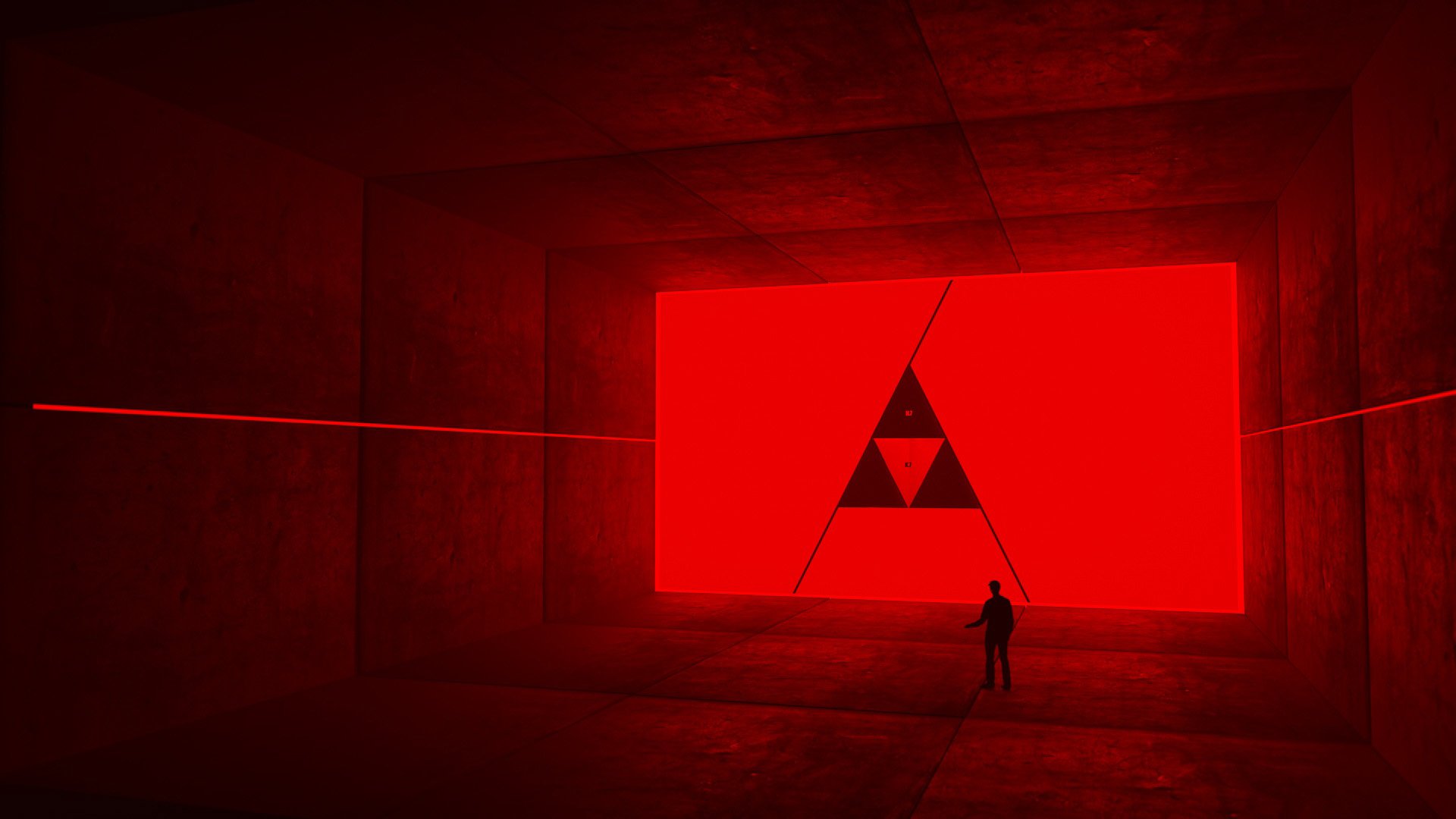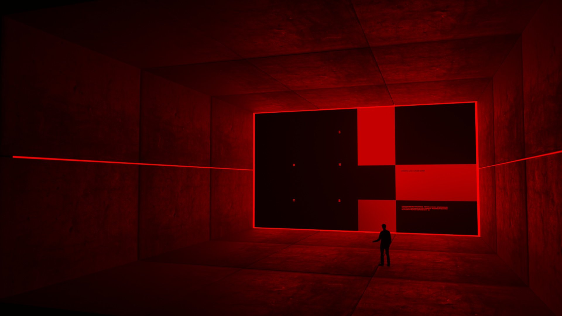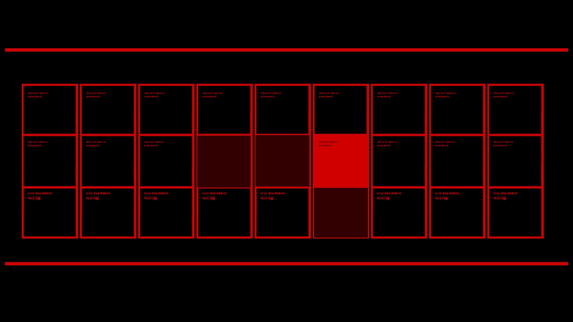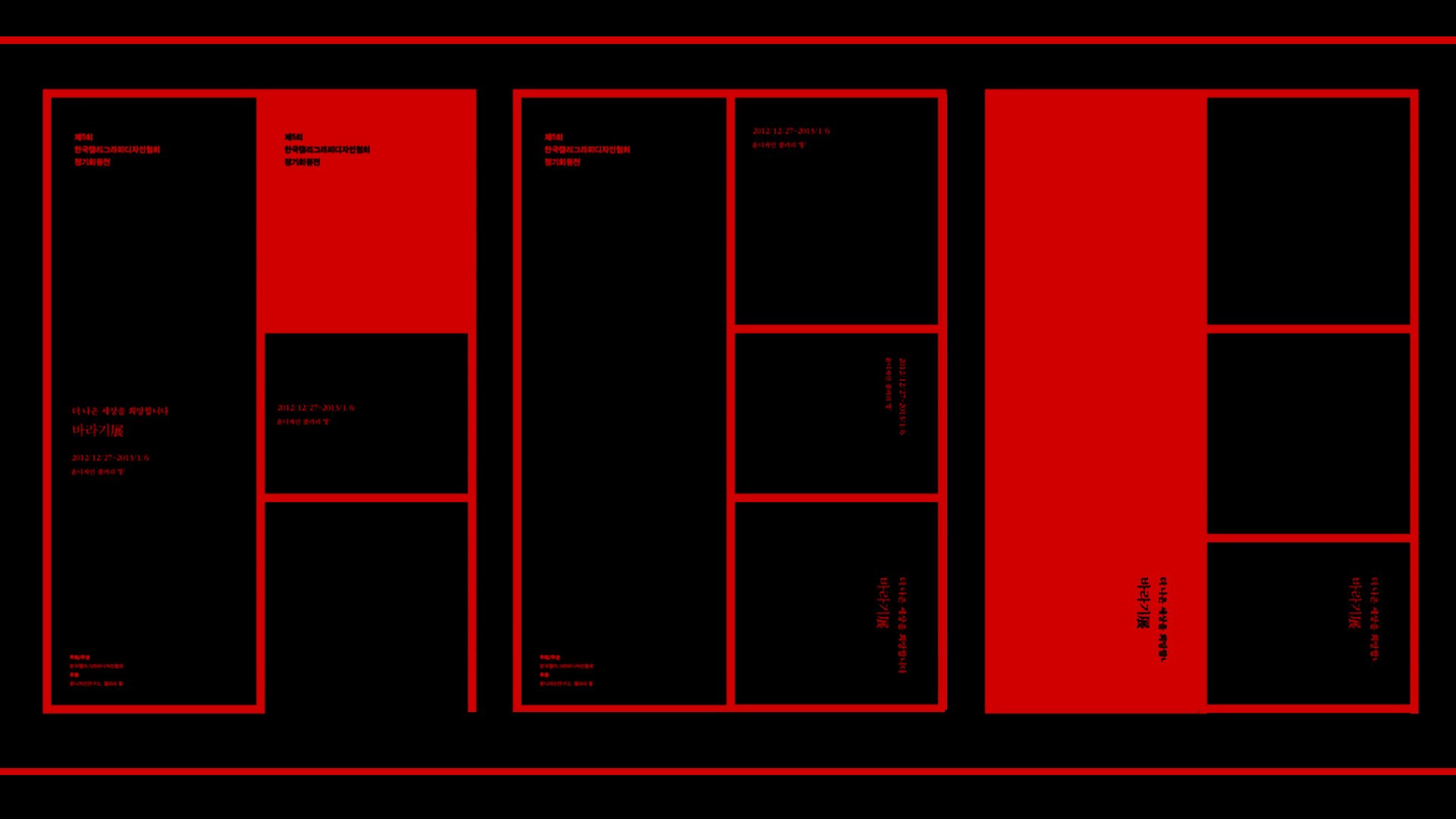
Designing the nemesis character systems for No Time to Die was a uniquely atmospheric challenge, centred around crafting a bespoke UI language for Lyutsifer Safin. The direction drew heavily from Russian brutalism and Cold War-era visual culture, embracing stark geometry, monolithic structures, and a sense of oppressive control.
We set out to create a near-future operating system framework governed by an AGI “mother” intelligence, echoing the calm, omniscient presence of HAL 9000. The system was conceived as something Safin could converse with—an entity of superior intelligence, yet visually grounded in a heavy, mechanical, almost archaic brutalist aesthetic.
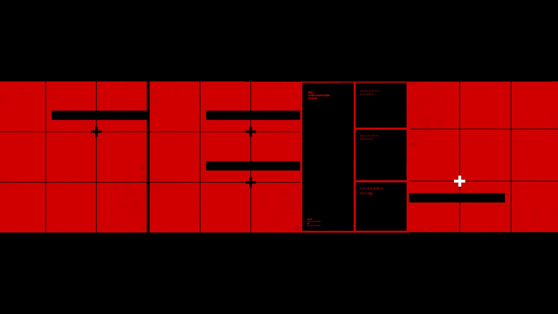
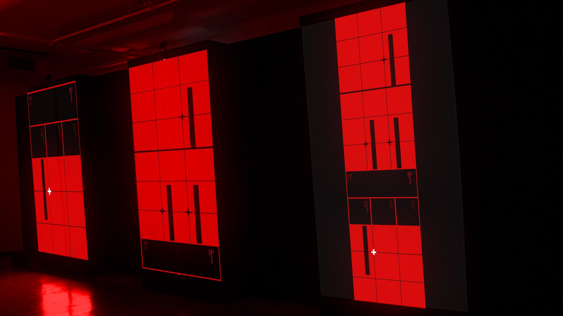
The interface language was built around strict spatial logic. Motion behaviour was confined to a grid-based system, with elements sliding along the XY axis and scaling across infinite parameters. This created a UI that felt otherworldly and highly advanced, yet inherently legible, allowing audiences to intuitively follow how information was structured, revealed, and controlled.
Visually, the design drew from Soviet-era instrumentation, industrial control panels, and Cold War infrastructure—power stations, mechanical command systems, and analogue interfaces. This translated into rigid grids, utilitarian typography, and a sense that everything was engineered with purpose rather than styled. The operating system needed to feel both incredibly advanced and physically grounded, heavy, cubic, and systemic.
The colour palette was predominantly anchored in red, with restrained accents of primary colours used sparingly to guide hierarchy and interaction. This restraint reinforced the tone: controlled, dangerous, and precise.
We also explored concepts for environments predominantly lit by LED video walls, designing graphics not just as screen content, but as integral components of the spatial language. This allowed the UI and the physical set design to merge into a single cohesive system, where light, surface, and interface became one unified visual experience.
The result was a system that felt intelligent, imposing, and deeply character-driven, an extension of Safin himself. One of those projects where concept, narrative, and design language aligned perfectly – loved this one